It’s with mixed emotions that we’re ending work on Leadformly today.
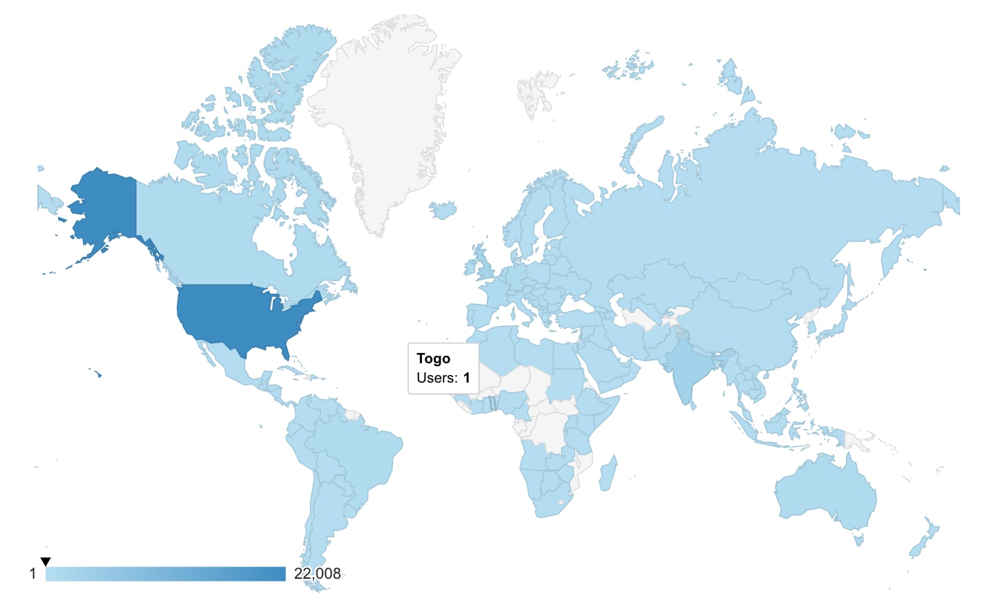
As many of you know, Leadformly was our first foray into SaaS. What began as an experiment with interactive forms, turned into a tool used by over 10,000 small businesses in 150+ countries over the years.

When we created LeadFormly back in 2016, there weren’t many good form builders (unlike today) and upgrading to a LeadForm gave many businesses a genuine way to 2-3X their leads. Since then, forms have got better and alternate solutions like chatbots mean that Leadformly no longer gives businesses the competitive advantage it once did.
Leadformly has been invaluable, generous and at times humbling in the lessons its served us. We learnt the importance of good architecture the hard way, how not to name a venture (we almost called it Qualiflower), as well as countless ways to improve how we build and release products.
Perhaps the biggest lesson, though, is knowing when to stop. In hindsight, we should have done it a long time ago. Leadformly is a great product, but it’s not the product that’ll achieve our vision. Nothing is more important than focusing on the right things and, while uncomfortable, improving focus often requires subtracting the things that distract us from our goals.
What’s next?
For the time being, we’ll continue to support existing customers before we begin the process to wind down the platform. If you’re a customer your account, LeadForms, and leads will remain safe and accessible in Leadformly until then. We’re also not taking on any new customers.
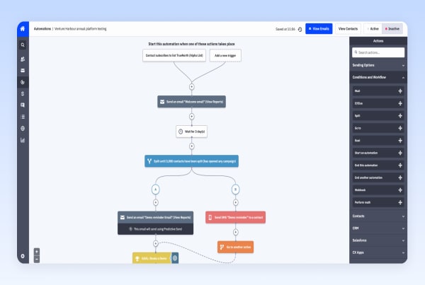
As we move into 2022 we’ll be doubling down on TrueNorth, a growth marketing platform that helps marketing teams hit their objectives by tying marketing activity to results.

TrueNorth is our most ambitious and promising venture. It’s aligned with our vision, our strengths, and the needs of modern marketing teams.
While Leadformly played its part in making Venture Harbour one of the fastest-growing UK tech companies, it’s time for us to refocus on the challenge ahead and what will achieve our 2030 vision.
What got you here, won’t get you there.
Marshall Goldsmith
Final words
This announcement has been bitter sweet to write.
The next chapter for Venture Harbour is an incredibly exciting one and I believe that our most innovative, successful ventures are yet to be built.
At the same time, this is the end of an era for myself and many people who came together to work on Leadformly. I’m immensely grateful for all of the moments and relationships made possible by Leadformly.
With that, I’ll say a huge thank you to Ryosei, Ben, Rajinder, Dhananjay, Kristine, Martina, Jay, Swapnil, Coenraad and the entire team at Venture Harbour and Alphalogic. And of course to all of our amazing and supportive customers over the years – I hope we see you again in another venture!
Onwards,
Marcus